What's that saying about old dogs, new tricks? Learning new tricks with your stamping supplies is valuable as it stretches not only your supplies but also your wallet. In Altenew Academy's Magical Marker Techniques course I learned that there are more ways to use alcohol markers than just for coloring. I really liked the brayering technique for making backgrounds as it gives a more "organic" look to the backgrounds.
For the background of this card I used Altenew's Artist Marker in Evergreen and a brayer on white cardstock. To add a little more interest I stamped the tiny leaves from Altenew's Ornamental Flower set in a random pattern in Altenew's Frayed Leafdye ink. The dark Evergreen is lighter when brayering it over the background and the lighter Frayed Leaf ink matched well.
The flower and leaves are from Altenew's Ornamental Flower set and were stamped in Altenew's Crisp Dye inks in Sea Glass, Ocean Waves, Dusk, Desert Night, Frayed Leaf, Forest Glades, Evergreen, Fresh Lemon, Honey Drizzle, Orange Cream, and Autumn Blaze. If there were any missed edges from the layers I was able to touch them up with the Artist Markers in the same color. These markers match the dye inks so well that you can add more details after stamping the layers if desired. After stamping them I cut them out with the matching dies. The sentiment is from Altenew's Halftone Circleset and was stamped with Jet Black, also from Altenew.
The pearls were white but colored with Artist Markers in Desert Night and Dusk.
To put the card together I added the background to a piece of dark blue cardstock, added a strip of the blue with a layer of white across the card. I positioned the leaves and flower so that I could see where to stamp the sentiment and after stamping that, added the leaves flat and added foam tape to the back of the flower. Then added the pearls for the final touch.
Thanks for looking and I hope you can find new ways to use your markers!
Hello again, and welcome back! Today's course was all about heat embossing. Heat embossing gives cards the "Wow!" effect and every time a new stamper sees it done they fall in love with it. There are some tricks and if you take Altenew Academy's Impressive Heat Embossing course you would learn more ways to use embossing powders.
In the past I've used heat embossing to do simple sentiments, metalic-look tags, cracked glass, and even made jewelry. There's so much you can do with a heat tool and embossing powders, but the technique I chose to do on this card was to heat emboss with layering stamps. This took some practice as it isn't something I've done before but it does help you look at your layering stamps in a new way.
This card uses layers of heat embossing done with Altenew's Angelique Motifs stamp set.
The Process:
The embossing was done with Versamark ink for all layers, using an anti-static pad between each layer. I used white, silver, clear, and a mixture of clear with teal glitter. I made this mixture myself as I didn't have the color of glitter embossing powder that I wanted to use.
For the background I stamped the largest leaf spray twice on white cardstock, one stamped only once with Altenew's Crisp dye ink in Dew Drops and the second one stamped twice with the same color. I then stamped over the images with Versamark ink and used clear embossing powder and heat set. This made the leaves glossy. Then I took the third layer, skipping the second layer stamp, and stamped over top of the leaves with the Versamark and added the teal-glitter mixture and heat set. I used a blending brush to add a light touch of Dew Drops ink around the leaves and then wiped off the embossed areas with a clean towel. The piece was cut out with a stitched rectangle die.
I also cut another rectangle with the next larger stitched rectangle die out of an aqua cardstock and placed the stamped background onto this. They were both attached to the front of a white card base.
The flowers in this stamp set have three layers for the petals and more for the centers, and for some of them I did not use all the layers.
One of the smaller flowers was stamped on white cardstock with Dew Drops
ink with the first layer of the stamp and then clear embossed over. The
second layer of the stamp was embossed in white and the center was
embossed with the teal-glitter mixture. It was cut with the matching die
and glued down to the card front flat.
The largest flower was stamped on white cardstock and the first layer was embossed with white, skipping the second layer stamp, embossing the third layer with silver, and the center layer with the teal-glitter mixture. I cut this out with the matching die, and also cut a piece of foam with the matching die and glued them together.
The other smaller flower was stamped on vellum. To give the vellum some color I stamped the first layer with Dew Drops ink, and then embossed over it with clear embossing powder. The second layer was stamped and embossed with white. The third layer was stamped and embossed in silver. Finally, the center was stamped and embossed with the teal-glitter mixture. This flower was added to the card front with foam tape.
The sentiment is from Altenew's Heartfelt Sentiments and was embossed on the aqua cardstock in white and foam tape was added for dimension.
As a final touch, rhinestones were added.
A tip I would like to share when working with embossing layers with photopolymer stamps is to clean the stamps on both sides to get good impressions with every stamping as the anti-static powder will start sticking to the stamp and will leave tiny areas on the stamps that will not make a good impression. If the back side of the stamp gets too much powder on it, it will not stick to the acrylic block or the door of the Misti well. These stamps are sticky so I usually take them all to a sink and wash them off well so that there is no powder left on either side of them. (Be sure to put the stopper in the sink!) I hope this helps!
Not being an art student, one thing I struggle with is using a color wheel and how to mix and use colors. Altenew Academy's Color Your Day class was perfect for me and really helped me with this. Since I'm a retired high school math teacher, having a "formula" for how much color to use made perfect sense to me! Don't worry, you don't need a degree to figure this one out, as it's simple percentages, which I applied to this card.
The Process:
Starting with a piece of champagne metallic cardstock, I blended inks in a diagonal from the bottom right corner toward the center. I used Distress Oxide inks in Antique Paper, Brushed Corduroy, and Vintage Photo.
I used a set of nesting oval dies and cut the larger oval out and then with the next smaller I made a frame to fit inside the larger oval with a metallic copper cardstock. I treated this with an anti-static pad as I was planning to emboss on it.
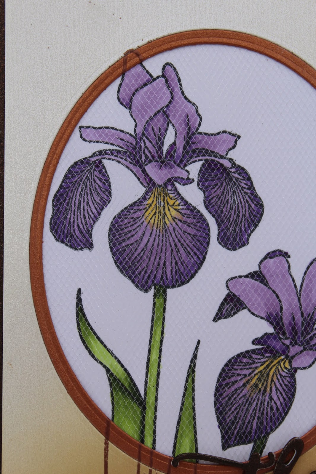
Using the Misti I positioned Altenew's Enchanted Iris stamps on the frame and inked them with Versamark ink and used copper embossing powder to emboss on the metallic frame. I also embossed the butterfly from Altenew's Painted Butterflies in the top-right corner. To get that one leaf on the far left edge I had to mask off the stem and stamp it separately to be behind the stem.
Once the frame was embossed I placed a piece of white cardstock in the Misti in the same position and stamped the irises and leaves with Momento Tuxedo Black ink so I could color them with alcohol markers. I colored them with Altenew's Artist Markers in Lavender Fields, Deep Iris, Mango Smoothie, Frayed Leaf, Forrest Glade, and Emerald.
From the back side of the frame, I affixed a piece of shimmery tulle fabric over the oval hole in the
frame and positioned it over the colored image so that the embossed
lines of the frame lined up with the image. The tulle has a slight bit
of sparkle and gives the entire image a little shine.
I've used this instead of acetate for shaker cards and it doesn't give the glare that you sometimes get with acetate.
The sentiment is from the matching die set and was cut from bronze metallic cardstock and popped up by cutting it from foam also. The tip in the class for doing this was invaluable! The "for everything" is also from the Enchanted Iris set and was stamped with Versafine Black Onyx.
The entire piece was glued to a piece of bronze metallic cardstock and added to a white top-folding note card. Thanks for looking and I hope you had a color inspiration!
Sometimes it's nice to do a plain and simple card but the details we add to cards make them unique and the receiver will notice those extra special touches and know that you cared enough to add them. If you were to take Altenew Academy's Beautiful Details class you would learn lots of ways to add your own one-of-a-kind touches.
Altenew's Peony Bouquet stamp set has become one of my favorite sets and the floral images come out so beautiful by stamping the layers as they are intended, but I wanted to add a little extra shading and details for this card. This card needed a special background to set the peony images off so I started with a piece of vellum cardstock.
After treating the vellum with an anti-static pad I stamped two images from Altenew's Golden Gardenstamp set with Versamark ink and used clear embossing powder. I have to admit I colored with several different markers and pencils to get these images to look how I wanted them to. It's true that my coloring always looks worse before it gets better and I learned to stick with it from this course!
I used a combination of Altenew's Artist markers in warm gray shades (WG01, WG03, WG05, and WG07), Faber-Castell Polychromos pencils in Warm Gray II and Warm Gray V, and a Tombow marker color N79 to color the vellum leaves and flower.
I stamped the leaf outlines from Altenew'sPeony Bouquet with Distress Ink in Frayed Burlap and blended over it with Altenew's Artist markers in the warm gray colors above. I cut them out with the matching dies.
For the peony blooms I stamped the three layers with Altenew's Crisp Dye ink in Warm Sunshine, Orange Cream, and Autumn Blaze. To add more detail I used Faber-Castell Polychromos pencils in Pompeian Red and Middle Cadmium Red.
After adhering the vellum piece to a white card base I added an orange cardstock strip with a stitched edge along the fold edge. For a base for the flowers I cut a piece of white cardstock with a stitched square die, trimmed off a corner and mounted it with foam to the card with the cut edge along the fold. I glued down the leaves and the smaller bloom to the stitched square and added the larger bloom with foam.
The sentiment is stamped with Versafine Onyx Black ink and is from Altenew's Heartfelt Sentiments stamp set. For a final touch I added pearls in soft peach from Little Things from Lucy's Cards. Thanks for looking and I hope you found some inspiration to add some little details to your special cards.
Hello again, and today I'm sharing a card that I was inspired to do after taking Altenew Academy's Polychromaticclass. There's a wealth of information in this class and I especially liked the details about using colors in different ways.
For this card I stamped the image from Altenew's Needlework Motifs set in Versamark ink and heat embossed it with a satin pearl embossing powder. I don't remember what brand it was as it is very old. Then I used Zig Clean Color real brush markers to paint the images and blended with a fine paint brush and a water brush.Some of the areas within the embossed lines were so fine that I had to use a #2 paint brush to blend.
Fussy cutting an image this fine was not an option as the vines would not look right after cutting them out so I needed to do a background. I used Molotow masking fluid and applied it to the entire painted image. This masking fluid is water based, and in hindsight I realized I should have done this in reverse, masked the image, done the background, and after removing the masking fluid, paint the details.
However, I continued and after the masking fluid was completely dry I used the same colors that I painted the image with and applied a watercolor wash by scribbling them onto an acrylic block and spritzing them with water and applying them to the background. I decided I needed some darker spots, so I used Altenew's Ocean WavesWatercolor Brush Marker to splatter the background.
I let this dry and removed the masking fluid with an adhesive-remover eraser and die cut it with a stitched rectangle die. Where the masking fluid blended some of the colors I added more color with the brush markers.
I used a piece of matching green cardstock and ran it through the die
cutting machine with Altenew's Dotted Swirls Debossing Coverdie which only added
tiny holes in the cardstock. To make sure the watercolor paper stayed flat I affixed a rectangle of fun foam to the back which also gave it dimension.
The sentiment is from Altenew's Heartfelt Sentiiments set and I used silver embossing powder on a strip of vellum cardstock and wrapped it around the entire piece and then added it to a white card base.
For a final touch I added green and blue jewels from Little Things from Lucy's Cards.
How many ways to watercolor? Too many! Altenew Academy's Creative Watercolor Media class is all about using what you probably already have if you stamp. I have tried different methods of watercoloring, some with success and some without. In this class you would learn easier methods of using the inks you have. Don't get me wrong, I still like the pan watercolors and I know there are many very expensive sets out there and it can be daunting to just decide what is best for you.
In the past I have watercolored with watercolor pencils, watercolor crayons, pan sets, and dye markers and they all have their advantages; however for this card I used the tried-and-true method of using dye inks. I didn't have the reinkers in the colors I chose to use, so instead I "smooshed" the dye ink pad down on a craft mat or acrylic block and picked up the ink with a paintbrush.
I decided to do a Christmas in July card, so I brought out Altenew's Modern Poinsettia stamp set. I like this set because I have the matching die and also the matching stencils. Stencils, plural, because Altenew does this great thing with the matching stencils, you get a negative and a positive stencil which makes either masking off the stamped image or the background easy.
The "positive" stencil can be set on the bloom making it easy to blend in the background. The "negative" stencil works by masking off the background. On this card I used the positive stencil that masked off the bloom so that I could blend the background in.
The Process that I followed:
I used a piece of Arches watercolor paper and stamped the bloom repeatedly with Versamark ink and embossed the images with white embossing powder.
After "smooshing" Altenew's Crisp dye ink in Velvet, Crimson, and Autumn Blaze onto the work surface I used a waterbrush with clean water and painted one petal at a time and then dropped ink onto the petal and let it bleed out.
For the background I used the matching stencil, placing it over a bloom and brushed Altenew's Honey Drizzle ink outward. The stamens were also painted with Altenew's Honey Drizzle ink and then I splattered Altenew's Fired Brick ink over the piece. When it was dry I used partial die cutting and the matching die to cut the water-colored piece out and added it to a black 4 1/4" x 5 1/2" cardstock. The sentiment was embossed with gold from Altenew's Holiday Wishes stamp set. I added gold sequins from Altenew.
Thanks for looking and try different ways to watercolor and see which one you like the best.
Take a simple stamping technique and give it a "twist," which is what Altenew Academy's With A Twist class is all about. In this class you would learn how to use stamps in other ways that maybe they were not intended to be used.
Over the years I've realized how stampers view and purchase stamps... it's often after they see a card they like made with a particular set of stamps, so they purchase those stamps and replicate that card. Although this works well, it doesn't give much life to their stamps if they can't see other ways to use them. If you were to take this course you would see how to take a stamp set and use it in many different ways, giving more "life" to your stamps.
Usually I wouldn't use orange and teal together, but found it worked for this card. I chose to cut away a section of the card, add acetate in the cut-out section and do the flower and leaves differently than usual on this card. What's usual for me? Coloring in black images would be my usual method for making the following card.
I don't like to clean it off stamps with solvent cleaners, so I usually avoid StayzOn ink, but when stamping on acetate, it's necessary!
As you can see, I didn't use a green shade for the leaves, but two shades of blue. I used a piece of pool cardstock and stamped the leaves from Altenew's Peony Bouquet stamp set with Altenew's Crisp dye ink in Teal Cave and Aqualicious. I used a rectangle die set to cut a section from the card and a strip of gold glitter cardstock and then a piece of teal cardstock and added them to the edge. I added a piece of acetate to fill in the cut away section and stamped "hello" from Altenew's Peruvian Lily stamp set in Jet Black StayzOn ink.
I stamped the flower and leaf outline stamps from Altenew's Peony Bouquet set on white cardstock with Altenew's Autumn Blaze and Teal Cave Crisp dye inks. On the bloom I used a black Copic pen to color in the center and on both I used different shades of Prismacolor pencils to add shading to the bloom and leaves. Both were fussy cut and the bloom was added with a piece of foam tape for dimension.
I added Nuvo Crystal Drops in Morning Dew to the leaves and bloom, and since the drops are clear, they are difficult to see but I added them to the leaves and one on a flower petal.
So take a look at your stamps and imagine them used differently and try new things with them! Thanks for looking.
What's your favorite color? Usually everyone has one and sometimes it changes over time. Color comes in fashion, as we know companies have whole departments that try to predict the colors that will be popular so that they can steer their manufacturing products in that direction. Whether it's clothing, cars, home appliances, or whatever. Isn't it great that stamp companies make so many different shades of inks and paper for us to play with?!
In Altenew Academy's In The Mood For Colorclass, it was interesting to learn that different colors inspired different moods, or meant different things. I know often when I make sympathy cards they usually use some black, which must be some old notion from long ago that we still use today.
I decided to get out of my "rut" for this card and do a rainbow of colors to celebrate all colors and you could make this "your" card by layering it onto the colored cardstock of your choice to make it look completely different.
To make this card I started with a piece of 80 lb. Neenah Solar White cardstock cut to 4" x 5 1/4" and stamped different sized circles for a background using Altenew's Halftone Circles stamp set. This is such a versatile set and it was fun stamping all those different colors. The colors I used were all Altenew's Crisp dye inks in the following colors: Crimson, Autumn Blaze, Fresh Lemon, Orange Cream, Dusk, Just Green, Lagoon, Pinkalicious, Aqualicious, and Deep Iris.
I decided that I wanted to have the die cut greeting popped up, but instead of adding foam tape, die cut four different colors of cardstock and layered them so that there was a "rainbow" of sorts under the black die cut. I used Altenew's Simply Hellodie for this. I white embossed the sentiment from Halftone Circles on black cardstock and used foam tape to pop that up also.
Then I added some crystal dots for a little sparkle and affixed the entire piece onto a piece of aqua cardstock.
Thanks for looking and I hope you got some "color encouragement" from this post!
Hello, and welcome! Today's post is rather long (actually, it's REALLY long!) but needed as I have completed all of the Level 1 courses for Altenew's Educator Certification program and this post shows the process and completion of the final challenge for Level 1.
When I received the requirements for the challenge at first I was a little overwhelmed. I thought, "How can I do all that in two weeks?!" The challenge was to create two sets of cards with a minimum of four cards in each set, one masculine and one feminine. We were to use three elements of the course contents and also include some recycled materials. In addition, we were to create some type of gift packaging for each set of cards.
The Masculine Set
The courses for the masculine part of the challenge I chose were Easy Die Cutting, Layering 1, and Clean and Simple Boutique cards, although the techniques overlapped with other courses. The cards might not look clean and simple, but that's because the backgrounds are so different and bright.
One restless night pondering what to do and I remembered that I have an elderly widow friend who I often gift cards to as she sends many cards. She lives alone and has work done around the house often and told me she always needs thank you cards. I know she is having a new roof and other things in the house done this summer, so I decided that the Masculine set of cards would be all thank you cards and would be for her.
First thing I did was to decide on color choices. Since I received the challenge on the 4th of July, it had to be red, white, and blue for the masculine cards. And because I was planning on all of these for men doing work of some type for my friend, Altenew's Engineers Rule stamp and matching die set was the obvious choice. Here is the set of cards:
When I make a set of cards that I want to be cohesive, I start with the backgrounds and I will explain how I made each of the backgrounds using different techniques. One of the backgrounds is actually made by recycling all the trimmings from the other five backgrounds and I'll show you how that is done with a simple method. After I explain the backgrounds I will show how I made all the other elements on the cards.
First, the background for this card:
The images are from Altenew's With Gratitude layering set in which I used two of the layers of both size of leaves, stamping one layer in Altenew's Crimson Crisp dye ink and the other layer with Altenew's Desert Night Crisp dye ink on Neenah Solar White 80 lb cardstock. Since this was just an all-over random stamping it is an easy background to do. I did not add the stems of the leaves as I just wanted the colors and left some images falling off the edge. To finish the card I layered it onto navy cardstock, added a navy smaller frame with a red cardstock centered and added dimension with foam behind the white rectangle with a sentiment from Altenew's Heartfelt Sentiments, stamped in black and added the tool die cuts.
A more planned approach to this type of background is shown in the following card:
After I chose Altenew's Halftone Circles stamp set to repeatedly stamp the background with, I drew pencil lines diagonally across the white cardstock to plan where to stamp the circles:
A couple of tips to share here is a fast way to find the center of the cardstock is to lay a ruler diagonally from corner to corner in both directions instead of measuring, as the cardstock might not be perfectly square.
Another thing I did was to measure the stamp, figure how large I wanted the squares to be. Since I was using an acrylic block for this, I selected a block with gird lines on it and positioned the stamp so that the grid lines were lined up in both directions to the center of the image.
Aligning the stamp this way made it easy to stamp the circle in the same orientation inside each square by lining up the lines on the block with the intersections of the sides of the squares.
I decided I wanted a semi-gradient look and wanted the darkest shades of
red and blue in the center of the strip and for it to be lighter as it
moved towards the ends of the strips.
To achieve this, I stamped the
center square of each strip with the darkest color, Crimson and Desert
Night. For the squares on either side of the dark shades I inked the
stamp with Altenew's Rouge and pressed only half of the stamp into the
Crimson. For the blue side, I inked the stamp first with Ocean Waves and
then pressed half of it into Desert Night.
For the remainder of both
strips I stamped with either Rouge or Ocean Waves to complete the
stripes of color.
After masking off the red and blue strips with low-tack tape, I stamped the image along the center strip with Versamark ink and added white embossing powder and heat set.
Then I moved the tape from the blue circles up so that it covered only half of the embossed circles and used Crimson and Rouge inks with a blending tool to color in that half of the strip. I wiped the circles after with a clean paper towel to remove any red ink from the embossing.
I moved the tapes again so that the bottom half could be inked, and used Ocean Waves and Desert Night, again cleaning after blending the inks over this section.
To finish the card I white heat embossed the sentiments from Altenew's Heartfelt Sentiments onto a piece of red and a piece of blue cardstock, added them to the corners, trimmed off any excess, added the whole assembly to a piece of navy cardstock and added the small die cuts from Altenew's Engineers Rule.
Then I decided to play with alcohol inks. I have a few tips to share when working with alcohol inks that I have learned over the years. Here they are:
Move everything out of the way so you have room to work.
Have good ventilation.
Store the ink bottles right side up and don't let them lay over in storage as the ink sticks to the caps when it dries. If this happens, drip some rubbing alcohol along the edge of the cap and let it soak up into the cap to loosen it. I would invest in the tin storage container by Ranger as it holds the bottles up straight.
If you care about your nails, wear gloves. If you have artificial nails and get this ink on a finger, it will seep under the artificial nail and there goes your manicure!
Instead of using a straw to blow air to move the ink around, you can use Ranger's tool to squeeze (I don't know what they call it!) but if you have painful joints and plan on doing a lot of this, invest in a cheap airbrush. You can get an electric one on Amazon for around $40 and it'll blow air all day.
If you don't use gloves and get the ink on you fingers, rub it off with rubbing alcohol and then use some kind of exfoliating cleanser. The stain will remain but you won't get it all over the cards you're working on.
Usually I lay a paper towel over my work surface to absorb any drips as it will stain, but it doesn't stain a glass surface and cleans easily with rubbing alcohol.
I made three different alcohol ink backgrounds, one I didn't use, except
the trimmings. I used Yuppo paper and Ranger's Blending Solution and a
90% rubbing alcohol. The colors of Ranger's alcohol ink I used were
Crimson, Sailboat Blue, and Indigo.
On one background I added drops of color and some blending solution and blew them around with the airbrush.
On another I taped a scrap of cotton batting onto a 6" plastic ruler,
added drops of the inks along the edge, leaving white spaces between, and then adding blending solution over the batting.
Then I dragged the ruler across the Yuppo paper and wiggled it back and forth to give a little zig-zag and to blend the colors slightly. I only used some of the trimmings from this piece on one of the cards.
This shows both of these backgrounds complete.
The final background with alcohol ink was to use Altenew's Artist markers in Ruby Red and Desert Night with blending solution. I liked the way this one turned out and I will probably make some more with different colors.
First I scribbled the markers in a diagonal across the Yuppo paper, leaving white space between the colors.
.
Then I ran a fine line of blending solution down along the white spaces, letting the solution run over into the colors
Here's a close up of the cards with alcohol ink backgrounds:
This is the one with drops spread with the airbrush.
I used Altenew's Thank You die to cut two layers from white cardstock and one from black.
On the black one I used direct-to-paper to add Versamark ink to the front and 3 layers of clear embossing powder for shine. I glued it offset so that a small white shadow showed under the letters.
I also added the clear embossing powder to the hat die cut so it would be glossy and popped it up with foam tape.
I stamped the "best hat" sentiment from Engineers Rule in Dessert Night and cut it out with a stitched fishtail die.
The piece is added to a navy cardstock.
This is the background I made with the artist markers and decided to make this into a shaker card.
To make the shaker I used the other background and cut a star by nesting a couple of star dies together, glued it to a piece of plastic from a stamp packaging (recycled), and added foam tape around the edges. I cut a wider star using two of the other dies in the set from silver glitter paper and glued it to the front, added star sequins in red, sliver, blue, and some tiny clear stars and added the shaker window section.
The sentiment and die cut are both from Altenew's Engineers Rule stamp set.
The entire assembly was again added to a piece of navy cardstock.
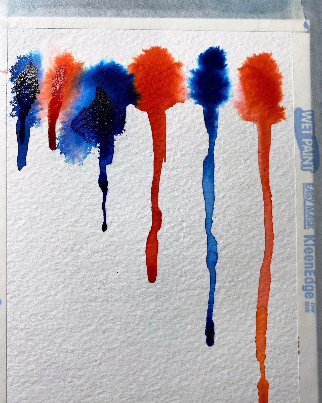
The other technique for a background is on watercolor paper. One thing to make sure of when you're using these two colors with water-based inks is to check how they mix. To do that, so I don't get any surprises, I used Altenew's Waterbrush markers in Crimson and Dessert Night on a scrap of watercolor paper and let them bleed together. I used a paint brush with plain water to make them run together and this is the result:
If you'll notice in the bottom left, the color that you get if they get too close and diluted is not very pretty, so I knew that I needed to keep these two separate. Here's what I did:
First I taped all fours edges of a piece of watercolor paper down onto one of my flat die cutting plates.
The paper is 4 1/2" x 6" and so it will be trimmed down.
This will help prevent warping, especially with the application I was planning on doing.
Using a paint brush with clean water I ran it across the top edge of the paper with the entire piece held vertically so the water would bead and drip.
Working with one color at a time, and still holding the paper vertically and the brush vertical, I tapped the brush against the paper along the top edge.
I did this for every other "drip" across the end of the sheet.
When finished with the red, I did the blue with the Desert Night brush.
I let this dry thoroughly, and then decided it needed more, so I repeated the same process on the other side, making sure the lines of drips did not intersect.
Here's the final card:
After the background was all completely dry, I cut black hexagons from a nesting set of dies, one for the sentiment in the center, a white one, and a black frame using two of the dies nested together.
I embossed the sentiment from Altenew's Heartfelt Sentiments in white. This sentiment is all on one line, so I stamped and embossed the "Thanks" first, masked off part of the stamp when I stamped the "You" beneath it.
I popped up some of the gears onto others and added them, again from Altenew's Engineers Rule stamp and die set.
The entire piece was affixed to navy cardstock..
The last card in the set has a background made from all the scraps of the others. Even though some scraps were 80 lb cardstock, some watercolor, some Yuppo, they worked fine together. Here's how it's done:
I used half of a Sizzix Sticky Grid paper to lay out all the pieces, fitting and trimming them when necessary. The grid paper works well as you can reposition pieces and move them around but they stick enough to hold them in place while you're laying them out. The grid lines also help to keep the strips of paper straight.
Once you have them all positioned on the grid paper, right side up, take the other half of the grid paper and place it down on top, against the right side of the pieces.
Then flip the entire piece upside down on your work surface and carefully peel off the top grid paper.
At this point you can add any adhesive you want and place a piece of cardstock over it and they will all be glued down together. All you have to do is flip it again and peel off the other grid paper.
I find it is easiest to use a sheet adhesive for this, and I used Stick It and adhered a piece to my cardstock first, peeled the release paper off and pressed it down onto all the pieces, burnishing it with a bone folder.
Here's the final card made with all the trims:
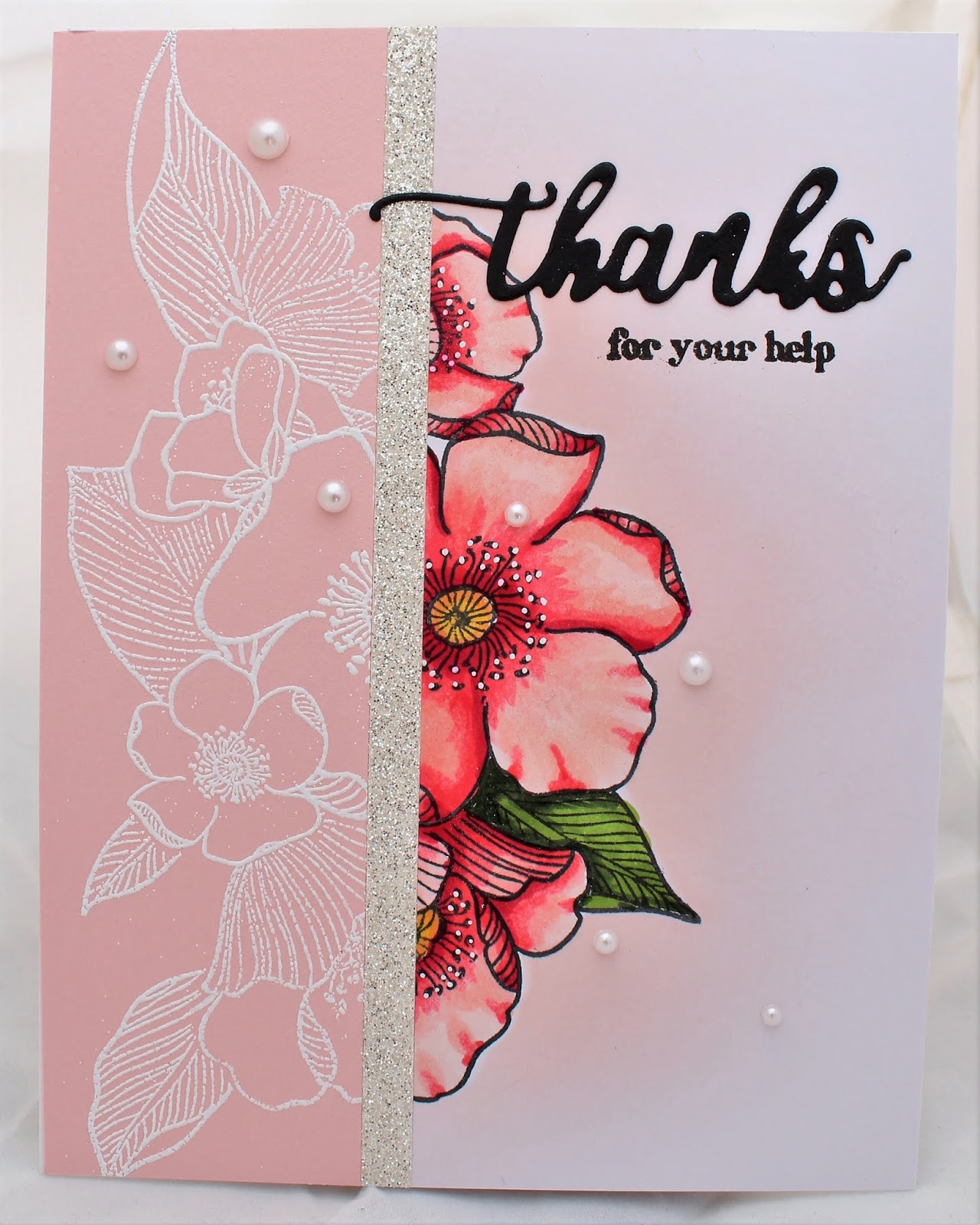
To put this together, I cut two circles, one with red cardstock, one smaller with white cardstock and stamped "Thanks" and "for you help" in black ink. Both of these sentiments are from Altenew'sEnchanted Iris stamp set. The white circle was added to the red one with foam for dimension and trimmed to set in the corner. The die cut tools were added, some glued to the white, some with double-stick foam tape. The entire piece was mounted on a piece of navy cardstock.
All of the cards were then added to the front of a white A2 card base that was 4 1/4" x 5 1/2".
Once all the cards were made, I stacked them with envelopes and measured the stack to see how big the container had to be to hold them. I wanted to make a container that I could "refill" for this lady, so I opted to make a box with a flip top.
I used a recycled energy bar box as it was the correct width and depth, plus a piece of cardboard from the back of a pad of paper.
The box was taller than I needed, so I measured 3 3/4" from the bottom and cut it off, saving the top section.
The box was thin and needed not only stability added inside but I needed a "lip" to stick up around the inside for the lid to fit over.
From the cardboard piece I cut two pieces that were 4" x 8 1/2" and scored on the line between the 6" end and the 2 1/2" section, trimming off the remainder.
Folding these on the score line, they can be set down inside the interior of the box. I had to adjust them slightly, and they are not adhered down as the exterior needed covering first.
This shows the cardboard pieces inside the box, with an edge sticking out that the lid will fit over.
From the top of the box, I cut around 1 1/2" down. This needed stability added, so with the trim pieces cut from the ends of the cardboard, I added them inside the top of the box and then added a piece of wood-grain scrapbook paper to cover them.
Once the main sections of the box were complete, I used wood-grain scrapbook paper to cover the bottom of the box and the top of the box. On the bottom section, the paper wrapped over the edge of the box and then the cardboard inserts were slid back down inside.
So that the lid would open and close by flipping it up I needed to create a hinge along the back edge. I used a piece of black cotton fabric left over from a recent quilt I made and glued it inside the lid and glued it down between the cardboard liner and the back of the covered bottom of the box.
Just to add a little whimsy to this, I found a brass "lock" brad and added it to the front of the box.
Here's the finished product, showing the cards all fit and the top flips up and closes:
Now my friend can have cards for any workers and when she uses them I can make more!
This video shows how I made multiples of all the small die cuts from Altenew's Engineers Rule stamps and dies:
The Feminine Set
Now, after all the masculine cards were complete I started planning for what I wanted to do for the feminine set of cards. The same rules of the challenge apply, however I've decided to use different components from the Level 1 courses for these. I decided to use things I learned from the Easy Die Cutting, Ink Blending, and Let It Shine courses. The color scheme for these cards will be the same, red, white, and blue, but in a softer, muted shades.
The colors of cardstock I was planning to use include two shades of blue and two shades of pink. I also added some Express white cardstock. I like this cardstock for using alcohol markers as it has a smooth surface with almost no "tooth."
When you can make cards so that you get "two-for-one," it is nice, but also you have to be careful putting them together, as you will see. I decided to choose an "open floral" as I was planning on coloring, so I chose Altenew's Adore You stamp set.
For the technique I am doing, I usually like to use one solid large floral image, but this set is all separate flowers and leaves, so I knew I had to mask images. First I stamped all the images from the entire set onto a piece of Eclipse masking paper using Altenew's Desert Night Crisp dye ink and then cut them all out. It didn't matter what color, it's just what was handy. I stuck them all down on a left-over piece of laminating plastic, which will stay with the stamp set as long as they are usable.
The design I had in mind is a repeated stamping of the same floral spray
eight times, so I knew I would not be able to use the Misti for this. I
have Stampin' Up's Stamparatus, which has 2 separate plates that can be removed and flipped, allowing me to position four sets of stamps to stamp in succession.
Masking this many images takes planning, so I first positioned all the masks how I thought I wanted them on a piece of cardstock the same size as the one I would be stamping on.
Images that are in the foreground need to be stamped first, so I positioned the stamps on the masks as they were to be stamped, closed the plate to lift them, removed the masks and stuck them on the side of the plate with a sticky note with a number telling me what order to stamp those in.
I repeated this step four times for all four layers of stamps.
The stamp in the bottom left of this photo was turned around for the remainder of the images, after the first stamping because I thought it should be facing down instead of up.
Because I was doing this over and over and needed to use the masks several times, I placed the masks on the side of the lid that had those stamps. This saves time, and the yellow sticky notes kept me from stamping the stamps in the wrong order.
First I stamped four of the floral sprays in Momento Tuxedo Black ink onto white Express cardstock. However, after stamping the first image I realized I had one of the blooms facing up and I wanted it flipped around, so I had to stamp another one. (I used this image repeatedly for other things later on, so it didn't go to waste!)
When all of the images stamped in black were finished, I cleaned the stamps well, leaving them in the same position, and repeated all those steps on the four colored sheets of cardstock with Versamark ink and embossed them with white embossing powder.
A tip for doing this with embossing, is that after each stamping, treat the cardstock with an anti-static pad, and dust off the masks after each use. Also, remove the masks before heating so they don't stick to the cardstock. If you noticed here, I only had 3 black images, as that one had the flower upside down... I decided to stamp another so I had four black and four embossed sheets. I did this because I couldn't decide which colors to put in a 6-card set, so I made an 8-card set!
Deciding which colors of alcohol markers to use is easier if you scribble 3-4 colors of the ones you "think" will match your cardstock onto the same paper you will be coloring on. Since I had that mistake piece, I blended four pinks and four blues together and laid the cardstock next to them to verify they were the colors I wanted to use. I did this for both the pinks and the blues.
I colored the black on white images with alcohol markers in the following colors, and will share a video of coloring one of the images. After I colored them all in I took a white gel pen and added white dots around the stamens of the blooms.
Altenew:
R400 – Blush
R101 – Rouge
R206 – Crimson
R217 – Velvet
B201 – Sea Glass
B313 – Dusk
B227 – Desert Night
WG01 – Morning Frost
WG03 – Evening Gray
Y205 – Warm Sunshine
Y612 – Caramel Toffee
G702 – Frayed Leaf
G715 – Forest Glade
G554 - Evergreen
Copic:
C00
C02
C04
W00
Now for the ink blending! That piece I said I was going to use later since it was a mistake? I fussy cut it close to the top edge and used it as a mask to mask off each of the images and blended a soft shadow around each of the floral sprays. I used Altenew's Crisp Dye ink in Rouge and Blush for the pink cards and Sea Glass and Ocean Waves for the blue cards.
I taped the bottom edge of it to my mat for a hinge and slid the cards down behind it to do the blending. This allowed me to lift it easily to see how much blending I needed to do.
After all the coloring and blending was done, I stacked pairs of pieces together, lining up the images, a blue colored one with a blue embossed one, etc. Then I trimmed off a slice down both pieces of cardstock at once. I wasn't measuring but just cut the floral images anywhere from an inch to an inch and a half in. So with this method, two images gives four cards... great deal!
I cut eight more pieces of a lighter weight white cardstock to assemble all the pieces and eight silver glitter cardstock strips. I used the grids on the media mat and taped down the cardstock and use the T-square ruler so that the strips would be glued down straight.
I added the strip of glitter cardstock after the narrow strip, and then the other side that matched up.
I then die cut eight "Thanks" with Altenew's Enchanted Iris die set from black cardstock and adhered it to the front of each card, and stamped one of the matching sentiments from Altenew's Enchanted Iris stamp set with Versafine Black Onyx ink. Here's the eight card fronts so far:
I adhered each of the card fronts to eight white card bases and added some Wink of Stella clear glitter over the colored images.
I decided to add more "shine" to the cards so I used an assortment of matching sequins and pearls.
Now to package them all together to gift!
I had the middle section of the tall cardboard box left over from the
masculine set of cards but it needed reinforcing. So I found another
piece of cardboard which was probably from the back of a pad of
watercolor paper. (I never throw this stuff out!)
I trimmed the box down to 3 inches tall.
I scored the cardboard and trimmed it and wrapped it around the box, taping it securely. Covering it all around with a light blue glitter cardstock. Then I lined the inside with the same dark pink cardstock that I used on the cards.
For a final touch I adhered a piece of white glitter ribbon around the top edge.
Needing a tag, I stamped more images, colored them in, and cut them with the matching dies and added them to a light pink tag, adding a strip of the silver glitter cardstock to the end. I stamped the sentiment in Versafine Black Onyx ink using the stamp from Altenew's Adore You stamp set.
Now I used a packaging bag and some silver ribbon to put it all together:
Here are photos of each of the individual cards in this set:
This one is the lighter pink with added pearls.
This is the "other half" of the above card with white pearls.
The darker pink with the pink pearls.
The "other half" of the above card with white pearls.
The light blue with blue sequins.
The "other half" of the above card with the blue sequins.
The darker blue with blue sequins.
And finally, the "other half" of the above card with white pearls.
I sincerely hope you have endured through this entire post, and thanks again for taking the time to read it and watch the videos!


 From the back side of the frame, I affixed a piece of shimmery tulle fabric over the oval hole in the
frame and positioned it over the colored image so that the embossed
lines of the frame lined up with the image. The tulle has a slight bit
of sparkle and gives the entire image a little shine.
From the back side of the frame, I affixed a piece of shimmery tulle fabric over the oval hole in the
frame and positioned it over the colored image so that the embossed
lines of the frame lined up with the image. The tulle has a slight bit
of sparkle and gives the entire image a little shine.


 After I chose Altenew's Halftone Circles stamp set to repeatedly stamp the background with, I drew pencil lines diagonally across the white cardstock to plan where to stamp the circles:
 Another thing I did was to measure the stamp, figure how large I wanted the squares to be. Since I was using an acrylic block for this, I selected a block with gird lines on it and positioned the stamp so that the grid lines were lined up in both directions to the center of the image.


 Then flip the entire piece upside down on your work surface and carefully peel off the top grid paper.


 For the technique I am doing, I usually like to use one solid large floral image, but this set is all separate flowers and leaves, so I knew I had to mask images. First I stamped all the images from the entire set onto a piece of Eclipse masking paper using Altenew's Desert Night Crisp dye ink and then cut them all out. It didn't matter what color, it's just what was handy. I stuck them all down on a left-over piece of laminating plastic, which will stay with the stamp set as long as they are usable.

 Images that are in the foreground need to be stamped first, so I positioned the stamps on the masks as they were to be stamped, closed the plate to lift them, removed the masks and stuck them on the side of the plate with a sticky note with a number telling me what order to stamp those in.


 I trimmed the box down to 3 inches tall.
  I scored the cardboard and trimmed it and wrapped it around the box, taping it securely. Covering it all around with a light blue glitter cardstock. Then I lined the inside with the same dark pink cardstock that I used on the cards.