Saturday, May 30, 2020

Gifting Card Sets

Packaging your cards in a nice box or wrapping ribbon around them to give someone makes a thoughtful gift and one anyone can use. I make and package many of my cards to give as gifts and everyone I give them to is so appreciative.

In this lesson I learned a simple trick to make my clear boxes special. I foiled the butterflies on the box and I thought, "Why didn't I think of this?!" Anyway, I added all my Clean and Simple Boutique cards with their matching envelopes to the box, wrapped a gold ribbon around it and it's ready to gift!
Thanks for taking the time to read these posts and I hope you have enjoyed the "simple" cards that I have learned to make!


Special Papers

Special papers are fun to use and often we hoard them because they are more expensive. Actually, I think I don't use them because I just like to look at them!! I am reminded of what Tim Holtz said on one of his Saturday demo days. He said we should use our supplies because they might go bad. This has happened to me with adhesives before, so I had this set of mirror cardstock I bought at a stamp show a few years ago and thought it was exactly what I needed for this card.

I cut Altenew's Leafy Frame Cover die from the gold mirror cardstock and adhered it to a piece of black cardstock with Mulit Medium Matte. Then the flowers were all stamped with Altenew's Adore You stamp set and cut out with the matching dies. I glued them down flat as I was planning to affix the sentiment over top and popped up. The sentiment is from a free set from Altenew that I just love. I like these little sentiments so much I just have to get the full label sentiment set next!

One of the blooms from the stamp set and a couple leaves stamped in black for the matching envelope.


Letterpress

Letterpress is exactly what it says... pressing letters or images into paper. For this card I used Altenew's Thank You die to make the impression into the paper. I used watercolor paper as I knew I was going to spray it and it needed to handle the water. Again, I used Deep Iris Crisp dye ink and pressed it into the paper. Leaving the words over the paper I used the Spring Garden Watercolor Brush markers to splatter the image and then I sprayed it with water to let some of the areas bleed a bit. I added Carousel Lights confetti from Honey Bee Stamps and affixed it onto a lime green card base.


Here is a closeup so you can see how the letters pressed into the paper:


I have done this before, but not with such thin script letters and I think I would use bolder dies in the future for this technique. I also ruined one that I had made because I was too impatient to let it dry and the layers slid apart in the die cutting machine. I will have to try again with a larger die!!

Foiling Techniques

Foiling has become a popular trend in cardmaking and there are many ways of doing this. I learned that you don't have to have a special foil machine! This was a very interesting class as I've used foil many times but did not know that I could do it with embossing! This has opened a whole new vista for me.

Again, I used Altenew's Golden Garden stamp set and stamped one of the layering images in Deep Iris Crisp dye ink and then stamped and foiled the outline images. The verse is from Altenew's Beautiful Inside and stamped in black ink.

I used one of the images and stamped in Deep Iris on the outside of the envelope.


Stamped Backgrounds

For this clean and simple card I stamped the background with black ink repeatedly with a bloom from Altenew's Golden Garden set. Then using Altenew's Watercolor Brush Spring Garden markers I scribbled off some of the different inks onto an acrylic block and used a paint brush to water them down a bit as I wanted a softer image. I stamped the sentiment on a strip of pink cardstock using Altenew's Sentiment Strips 2 set in black ink.

I made a matching light pink envelope as this was part of the class. It's been awhile since I stamped a background like this and it's good to be reminded that these ideas work well for clean and simple cards. Thanks for looking!

Friday, May 29, 2020

Single Layer Cards

If anyone knows me and my stamping "evolution" then you know that simple cards are very difficult for me. I just can't seem to stop, which is why this course from Altenew should help me get out of the "complicated" zone! Even when I designed needleart I was amazed at the designs that were termed "primitive." I would try to design them, but failed. So the Clean & Simple Boutique cards class is definitely for me. I have high hopes of conquering this deficiency in my card making.

Jennifer Rzasa teaches the class and so far I am impressed by the clarity of instruction and with her guidance I felt free to try this. I used the Watercolor Wonders stamp set for the flowers and the sentiment is from the Peruvian Lily stamp set. The black doodles were done with a Micron pen.


Thursday, May 28, 2020

Layering Lillies

Layering stamps can be done without a huge investment in ink pads, but we all like variety, right?! This first card is done by using one stamp pad for the background with the exception of the stamens of the flower images and the sponging, which was done with Vintage Photo Distress ink.

All of the images are from Altetnew's Layered Lily stamp set. The pink bloom is also done with one stamp pad except for the very center and stamens, which were stamped in a dark brown and black. The leaves were stamped with Altenew's Parrot, Olive, and Moss inks. One of the things I like about Altenew's ink pads are that you can purchase a set of four shades in mini pads or full size pads. But in this lesson we learned to use only one pad.

Here's the card:


But, of course if you have the colors you can use them, too!! This next example uses the same stamp set, but uses three different pads for the layers of the bloom. The background was made by using Altenew's Watercolor brushes in Warm Sunshine and Autumn Blaze on wet watercolor paper and letting the colors run and bleed. The flat confetti pieces are from Honey Bee Stamps. Thanks for looking and if you need more info on products used, leave a comment.


Painted Poppies

Moving right along with Lesson 5 of the Layering class. This was a valuable class as I've always struggled with lining up thin "stem" stamps, especially when they are photopolymer stamps. Usually I just color the stamps in with a marker as they are usually so difficult to place the "fill" color stamp over them but with the instructor's help with this it was easy!

Our homework was to create a "clean and simple" card with the Painted Poppy stamp set from
Altenew. I have to say, I really love this set and in its simplicity it is a beautiful set.Of course, I made two cards, one "simple" as directed and since we so recently celebrated Memorial Day, and remember the poppies of "Flanders Field," I had to do red poppies. My garden has the orange ones, so I had to do coral colored ones, too!

Here's the cards and I'll explain below how I made them:
The outline of the red poppies were stamped with Versafine black pigment ink. The reds were Stampin' Up's Poppy Parade and Cherry Cobbler ink and the greens were Altenew's Bamboo and Olive. The verse for both cards is from Altenew's Sentiment Strips 2 set. I white heat embossed it on black cardstock and used foam to pop it up of the card. I affixed the white panel to a piece of black cardstock.


Then I used a black gel pen to add dots to the center of the poppies to look like poppy seeds:


For the coral-colored poppies the outlines were stamped with Versamark ink and embossed with silver embossing powder and filled with Cameo Coral and Calypso Coral ink. The verse is stamped with Versafine black pigment ink.


Without the leaves to clutter the design it is very simple and the layering is very easy to do. The panel was affixed with foam to lift it off the card base. I hope you like these and thanks for looking!


Wednesday, May 27, 2020

Painted Flowers

This is another example of layering floral stamps. For this card the Altenew set Painted Flowers was used. One thing that I found out with this lesson was that practice layering flowers helps. I stamped several examples on scrap paper until I found just the right ink colors and also I think I got better at lining up a slightly more difficult set. If you don't want to spend the time lining the images up perfectly you could offset them a bit and still would get a beautiful image.

First I used a basic oval die set to trace in the center to give a guide for placing the floral images around. One thing I found out is that you need to stamp the leaves along with the blooms to plan spacing when doing this as I didn't want any overlap except for the images that were cut out and popped up. I filled in with the little sprigs that were in the set and the sentiment is from Altenew's Adore You set. I hope you're enjoying my journey through layering!


Tuesday, May 26, 2020

Whimsical Flowers

The Whimsical Flowers stamp set from Altenew is not only fun to layer, but also fun to color. First, since this was a Layering lesson, I used the layers to fill in the floral images. This is an easy set to layer as the images are bold without too many tiny details. The outline images can be embossed and colored or just stamped and colored, which gives this set versatility.


First I stamped the outline images on masking paper and cut them out as I planned to make a central bunch of flowers. Then I stamped the solid fills with Midnight Violet, Deep Iris, and Lavender Fields Crisp dye inks. The flower center were stamped with Mango Melody ink and the leaves with Bamboo Crisp dye ink. The small dots in the set were used to add several dots around the bouquet with Bamboo and Olive Crisp dye ink. Finally I added a little Wink of Stella over the leaves and flowers.

I embossed the sentiment from Sentiment Strips 2 in white on black cardstock and added foam tape to the back. I affixed the card front to a piece of mango cardstock.

It's sunny today and very difficult to take photos, and hopefully the shine will show on this photo:

  
Also, I thought these flowers would work well in watercolor, so I stamped them and embossed them on the smooth side of watercolor paper. When doing this, it's important to emboss one flower/leaf at a time and then mask before doing the next one so the masks don't pull off the embossing powder. 

I used Altenew's 24 pan set of watercolors, which I was anxious to try. Remember, I'm not an artist with watercolors, so this was my first attempt. I think I need more practice! After I painted in the images, I masked the flowers and thinned down the Coffee Bean and Fall Harvest paints and spattered the whole piece. I white embossed "Thanks," from the Enchanted Iris set on black cardstock and affixed the piece onto a green cardstock panel. Thanks for looking!


Friday, May 22, 2020

Scribbled Flowers

In Layering Level 2 we learned to layer images not only by stamping multiple layers together but to cut out different layers and layer images together.

The background of this card is watercolor paper that I sprayed liberally with water and then used Altenew's watercolor brush markers to drop ink down across the paper. First I applied Evening Gray and then added Sea Breeze. Once the background was dry I flicked the Evening Gray from the brush marker lightly over the paper. I like the tiny droplets that these markers give as I've always struggled with larger drops from a watercolor brush.

I stamped the images with blue ink on Neenah natural white cardstock and to get just the right shades I stamped off for the lighter color and stamped a first generation for the dark blue. The leaves I stamped with Weathered Wood Distress ink.

There is a matching die set for this stamp set, but alas, I didn't have it so I fussy-cut all the images out. Some of the leaves I stamped directly onto the watercolor background. The card base is Neenah natural white. I used the sentiment from the same stamp set and embossed it in white. Thanks for looking!


Thursday, May 14, 2020

Layering Stamps

This week I've started a new adventure: the beginning of the Altenew Academy's teacher certification program. I will be showing you my progress along the way here and I am excited to share with you what I have learned.

If you want beautiful images without having to "color" in each image, then layering stamps are for you. Altenew has the best floral layering stamps, some with fewer layers than others, but all turn out beautiful. The set I chose to work with today is their Build-A-Flower Magnolia. The flowers have 3 layers besides the outline image.

I stamped the first image with Lavender Fields, the second with Deep Iris, and the third with Midnight Violet Crisp dye inks from Altenew. For the two greens I used Olive and Moss Crisp dye inks. Even though the branch has a stamp to fill in the area I decided to use Altenew's Evening Grey Artist marker, which is an alcohol marker. The sentiments came from the same stamp set, which is filled with many sentiments that pair with the word, "You," nicely. I stamped them in black and also stamped the outlines to the images in black.

I wanted a "clean and simple" card so I did not add the sequins after all. Thanks for joining me on this new adventure!!


Layering stamps can be difficult at first but learning a few tricks will help which the class taught. Even if layers don't line up EXACTLY right the flowers will still look great. 

Monday, May 11, 2020

Excess of Backgrounds!!

If you stamp, you usually make backgrounds... you know, those sheets of "experimental" blends of color that you spend a whole day doing because it's so much fun to drop ink or watercolors onto paper and watch it move around?! Well, I've created a whole bunch of them in the past and this month as "social distancing" has become the norm, I decided to "clean" my stamp room.

I hauled out an abundance of backgrounds I've made over the past year and decided that I was not going to make new ones until these were used up. First I sorted and decided that I didn't need to do Christmas ones right now, so those got moved to another plastic "shoe box" to deal with later. 

What I had left was a half box of backgrounds that I really didn't know what to do with at the time I made them but I've been "forcing" myself to deal with them now.  

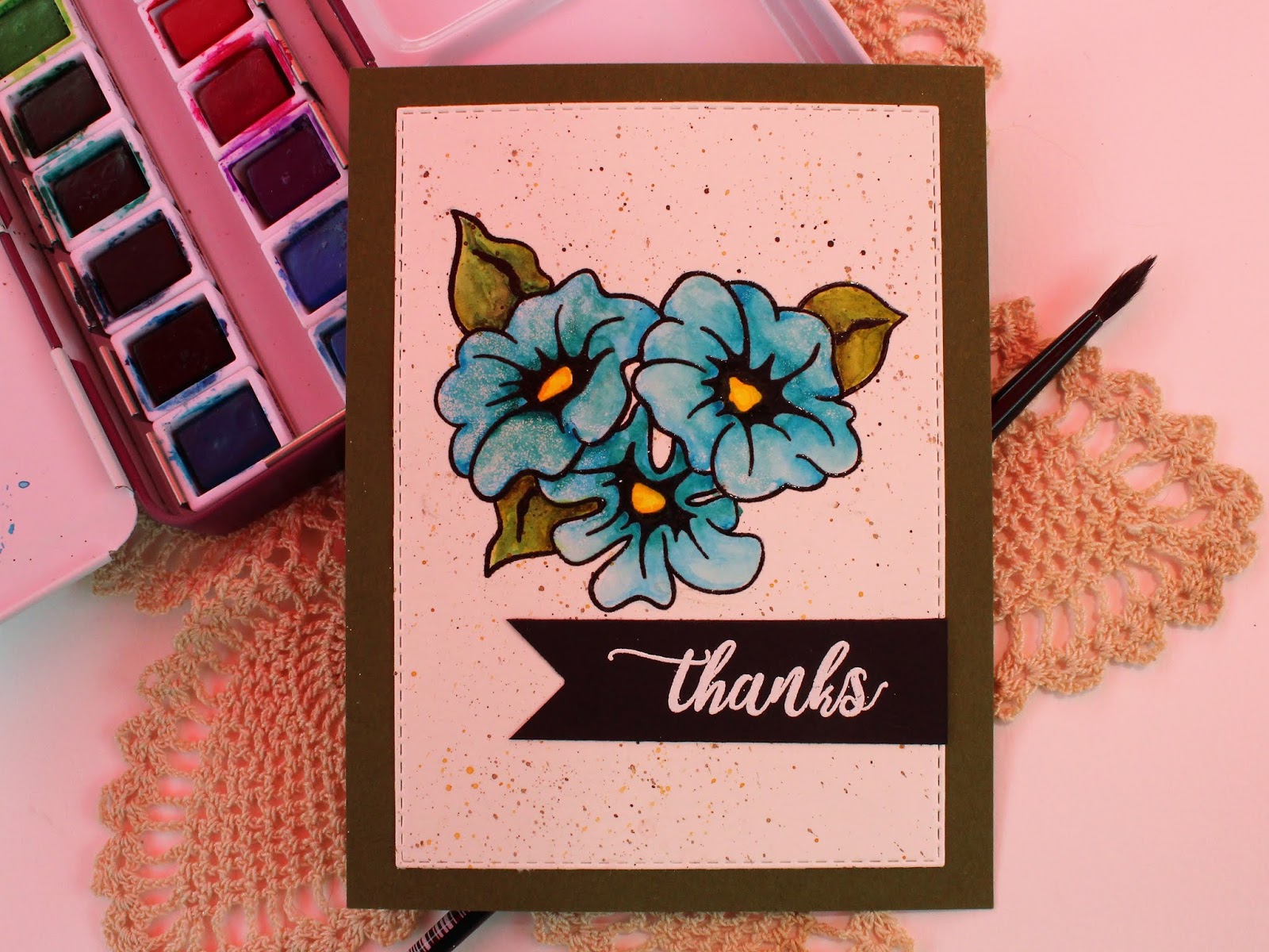
I found that there were several watercolor or color burst backgrounds that I could die cut greetings out of and then I embossed them with about 3 coats of clear embossing powder and it gave them dimension as well as an "enamel" look. Here's a few photos and hopefully you can see the words:


The top two were watercolor backgrounds that I "fixed" with a stencil and some Distress Oxide inks and then I embossed an image in white over the background. The left-most card shows a "hello" that was cut from a background of Distress Oxide ink on watercolor paper (mostly pink) and embossed with 3 layers of clear embossing powder.
On the top blue card, the watercolor background was "fixed" by using Distress Oxides over the stencil and embossing the stamped image in white again. To make the "hello" match the blues used on the background I used Salty Ocean Distress Oxide ink blended on a piece of scrap cardstock and used 3 layers of clear embossing powder over it. 
The bottom-most card was a "new" background as I had a stencil with all the ink from the blue card already on it that I spritzed with water and pressed onto a plain white piece of cardstock. 

The following shaker cards were done with alcohol ink backgrounds on Yupo paper and the words were cut from either watercolored or color burst backgrounds and embossed with clear embossing powder. I find that using this method gives dimension and shine without having to "cut and stack" several layers of lettering. 

 
Thanks for looking and I hope you give this a try!